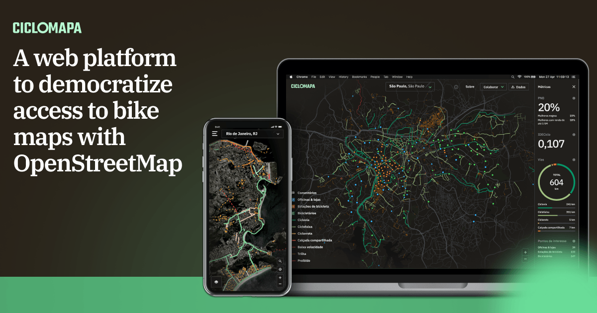
CicloMapa

Timeline
Roles
Team
Overview
Today in Brazil, we face the immense challenge of not having data on the cycling infrastructure available in our cities, which makes it very hard to paint a clear picture of our reality and measure the opportunities and impacts to society of improving urban mobility.
Strong partners
I’ve teamed up with UCB (Brazil Cyclists Union) and ITDP (Transport and Development Policy Institute), two of the most relevant civil society organizations in Brazil for cycling and urban mobility. We set to design and build the first unified platform of cycling maps, encompassing the entirety of the country’s cities.
Open data
This project leveraged the data and collaborative nature of OpenStreetMap (OSM), a huge global initiative, like a Wikipedia of maps. I’ve created an open-source web application, free and accessible from any computer or smartphone, aimed at the average citizen who doesn’t know their city’s bike paths and researchers, who now have easy access to data in an unprecedented scale.
Understanding the problem
As the main stakeholders of the project, my first activity was conducting a workshop using the Lean Canvas framework to ensure alignment on what we were going to build.

We decided the main opportunities we wanted to focus on this solution were:
Main opportunities
An unified Brazilian map
Encouraging open collaboration
Democratizing the data
We also found out some of our “unfair” advantages: UCB and ITDP are two of the most prominent organizations of this kind that could invest in this project and would be able to mobilize the community. Also, everyone on the team already had experience with similar projects involving web apps, interactive maps, and OSM data.
Research
To start organizing the Information Architecture, our first step was diving into OSM documentation and manuals on cycling infrastructures. Fortunately, we had on the team a specialist on OSM who helped us abstract the technical tags into something more accessible.
I started understanding the main types of bike paths, how they appear in Brazilian cities and what place in the a “quality and safety gradient” they would be placed.
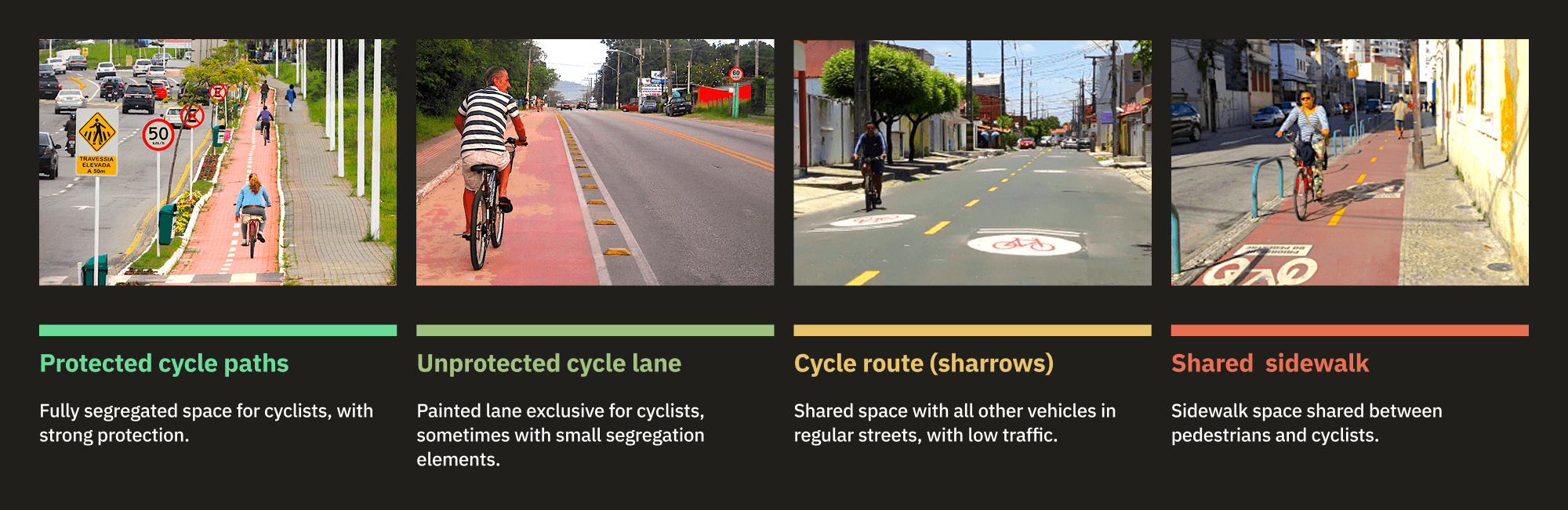
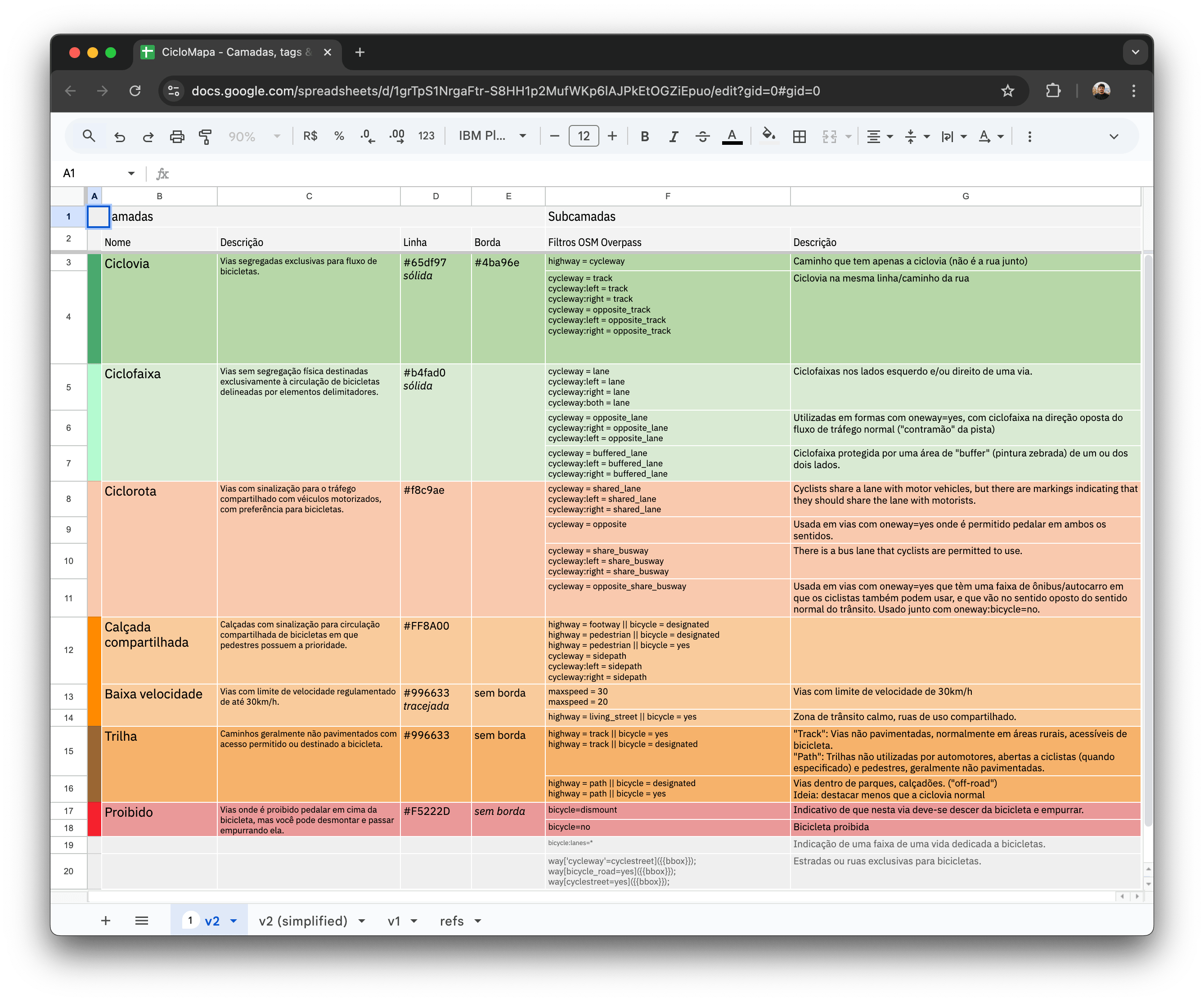
Making sense of information
I used this spreadsheet to organize the information architecture, documenting how we’d model the data filters, including labels, textual descriptions, and visual representations of data.
Benchmark learnings
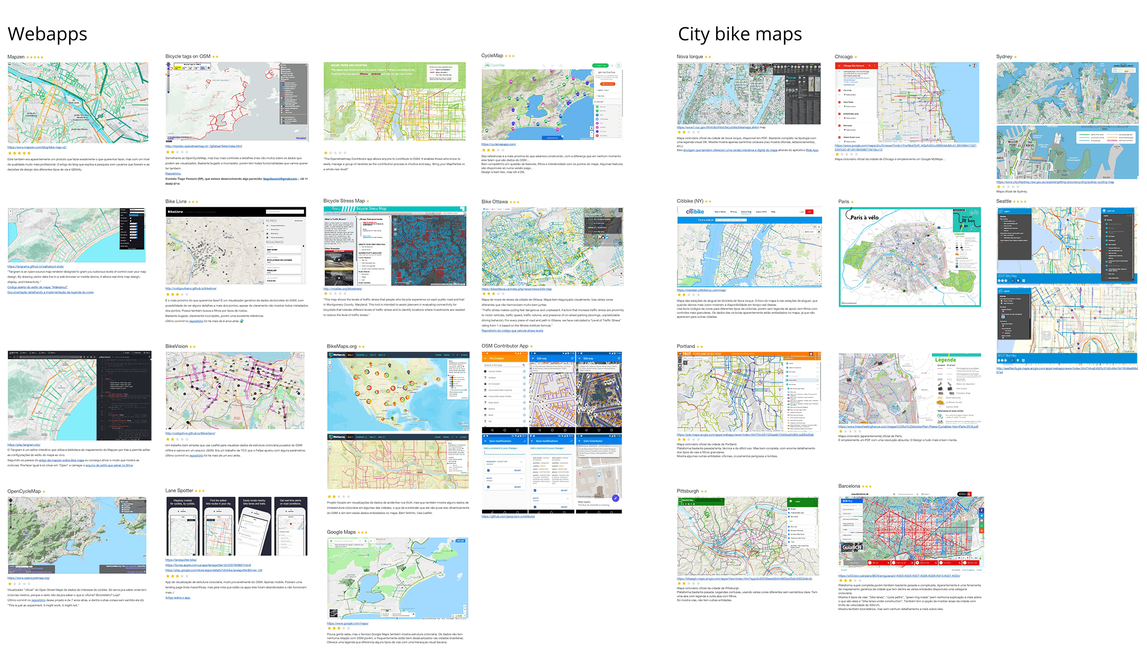
I did a deep dive into everything available on the market, from other map-based web apps to some PDF cycling maps from cities worldwide. At this step, we validated that our solution seemed to be innovative and unique since there didn’t seem to exist anything precisely like it. Still, we found intersections with existing solutions that gave us inspiration and new ideas on how to solve the problems. We learned that:
- Solutions based on OSM are very technical and hard to use, and none had clear instructions about the collaborative dimension and how to contribute to the mapping.
- Bike maps rarely explain their terminologies which are not very friendly to the broad public.
- When the maps present multiple typologies, these are often colored in somewhat random ways, producing a final result that is not only unappealing but, most importantly, confusing and overwhelming.
- Almost none were adapted to Mobile devices.
Prioritization
From these insights I facilitated workshops for brainstorming and prioritizing the main features we wanted to build. One of the frameworks we used to prioritize features in the beginning was the classic Effort/Complexity Matrix. I facilitated workshops with the team to fill the matrix, choose was features we’d build and their order.

Prototyping
Low-fidelity
It was important to start with a low-fidelity Figma prototype to validate the main features and visual hierarchy without putting on the table discussions on visuals—at least for now. Although it looks very different from the final version, the overall experience didn’t change much! We validated this prototype with potential users we started gathering on a small mapping enthusiasts community on Telegram.

With the references in mind and the well-defined typologies, I started sketching different ways to lay out these features on the screen. The concept always was to have the map as the main thing. Second, came the current city in focus, and third, the complementary UI elements to control the map, such as typology filters, address search field, “about” link, and the small but essential data download button.
Prototyping with code
At this point I was iterating on the prototype and validating with the community. However quickly I realized that such a complex interactive product, with all its interactions and microinteractions would be hard to validate solely on Figma prototypes. So, as soon as we had the basic features and mechanics set, I started moving to code.
Implementation
As the only developer on the team, it’s always a challenge to separate the engineering and design mindsets in the process. I forced myself to always ideate concepts on Figma first, validating with the peers and creating cards on our Trello board to document the task and prioritize it for development.
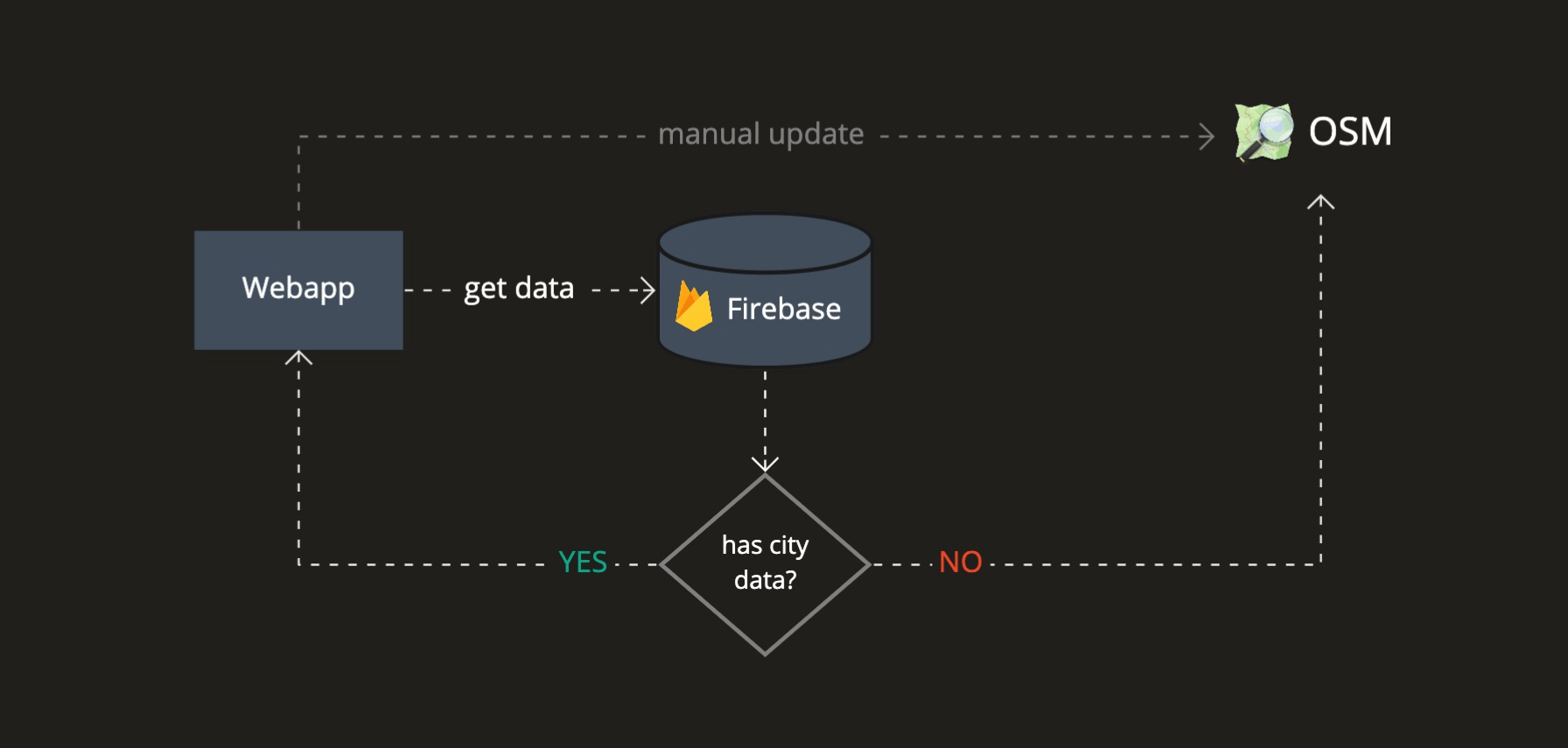
Iterating the architecture
The overall system architecture passed by many iterations. I started with straightforward ones to test concepts concerning the OSM Overpass API. I slowly added more complexity to mitigate the problems we saw, getting feedback from the stakeholders and our user community and always aiming to improve the user experience.
Exploring new technology
To build the UI, I chose Ant Design, a high-quality open React library with excellent documentation. I did all the styling with TailwindCSS, a fantastic CSS framework, to customize the Ant components to our visual identity and create layouts.
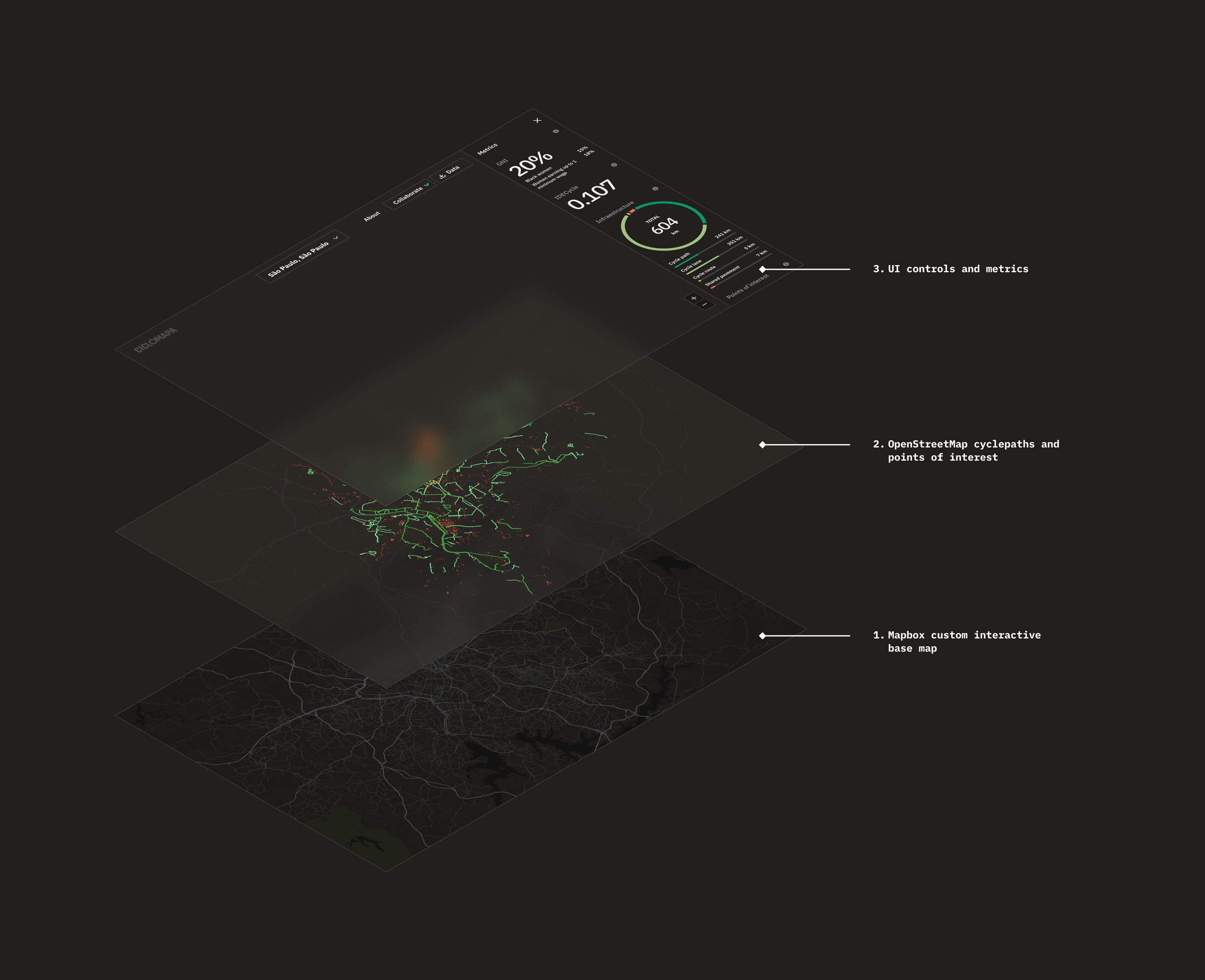
For this project, I also wanted to try Mapbox, an open map library built on top of OpenStreetMap. It offered much more flexibility and more advanced features compared with the Google Maps SDK I was used to. In addition, it was a pleasure using Mapbox Studio, their interactive map customization tool that enabled me lots of controls to be creative in designing our base map.
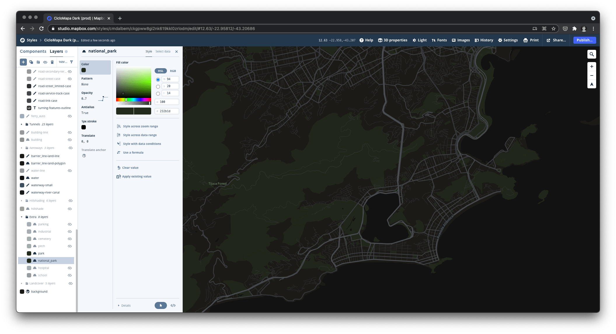
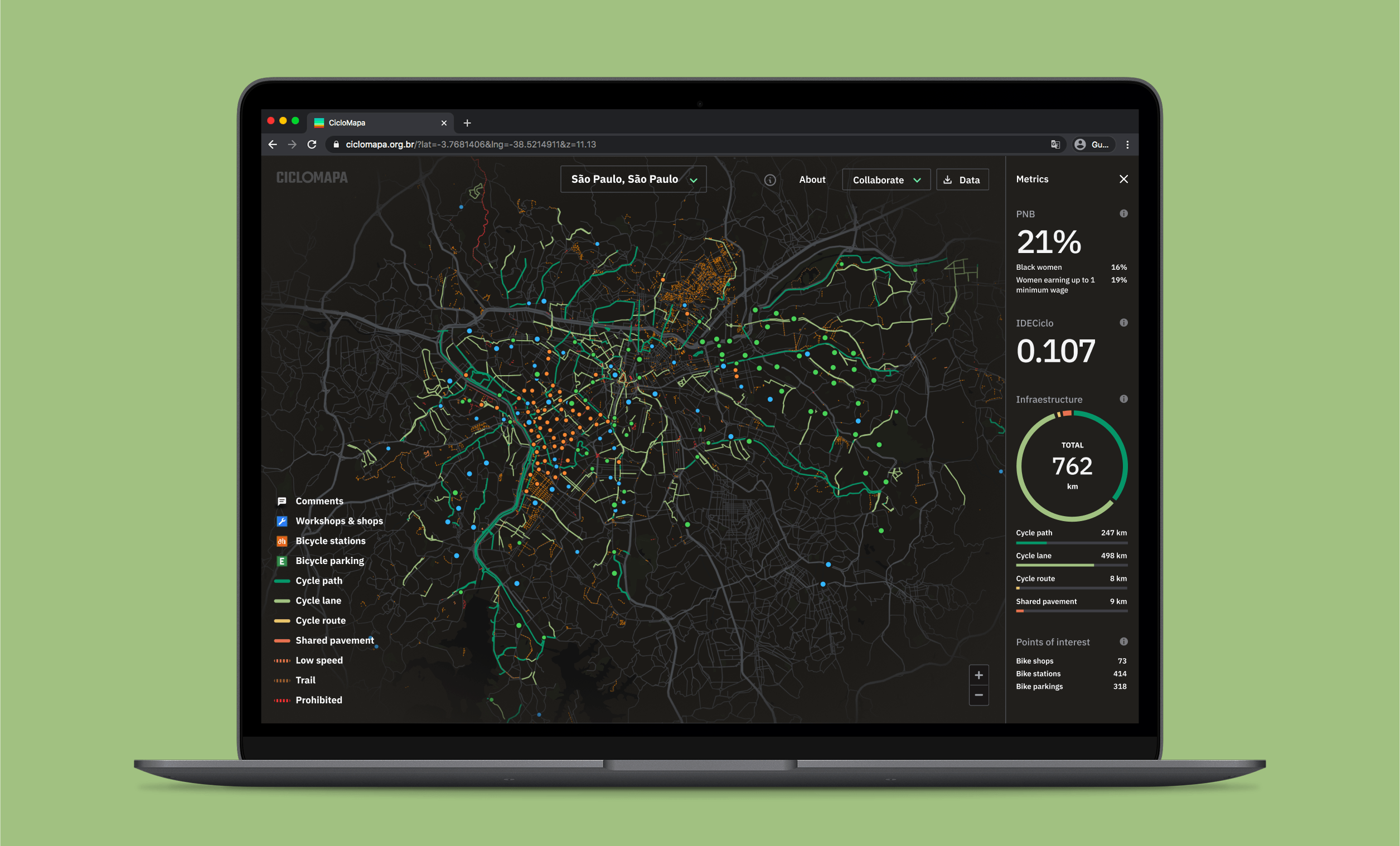
Beyond just customizing color palettes, the editor allows us to add new data layers, filter what we want to show, how, at what zoom level, and much more. When designing the points of interest layer, I created 2 hierarchy levels based on what are more “complex” data points.
Visual identity
Principles
With a very functional first version of the system up and running ahead of schedule I found myself with some extra time to make it pop. Based on all the process up to now I’ve devised some brand principles to start thinking on some visual directions:
- Serious instead of playful, since we’re dealing with important data that can impact how our cities and built. But we’re not formal or academic, we want to be relatable, so we can speak to the masses.
- Assertive and trustworthy: we’re experienced specialists on cycling and technology.
- Collaborative, communal and educative, since it’s based on OpenStreetMap. —>
Inspiration
The brand language draws inspiration from the night view of a city through an airplane window: the streets are glowing with vibrant colors like neon strips. The dark theme helps the data pop, while giving a sentiment of a technical tool.
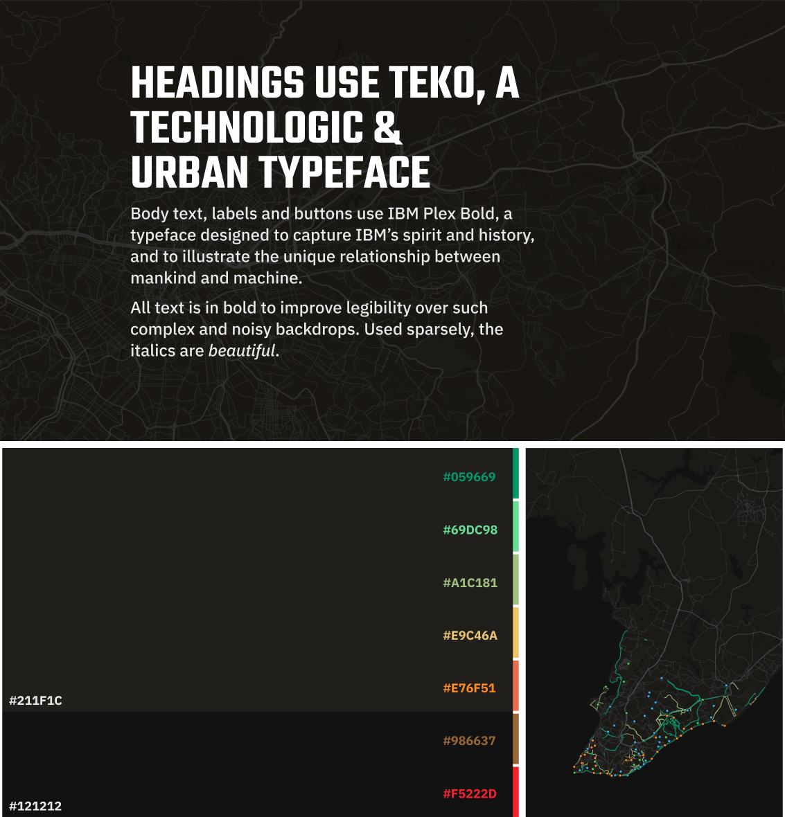
Designing the map
With the typography and basic palette set, I started customizing the Mapbox base map and the Ant Design components to match the style. Mapbox Studio is a formidable tool with very advanced features for customizing the interactive map that’d be used as the base layer, going way beyond colors and line widths to advanced data filters.
Features highlights
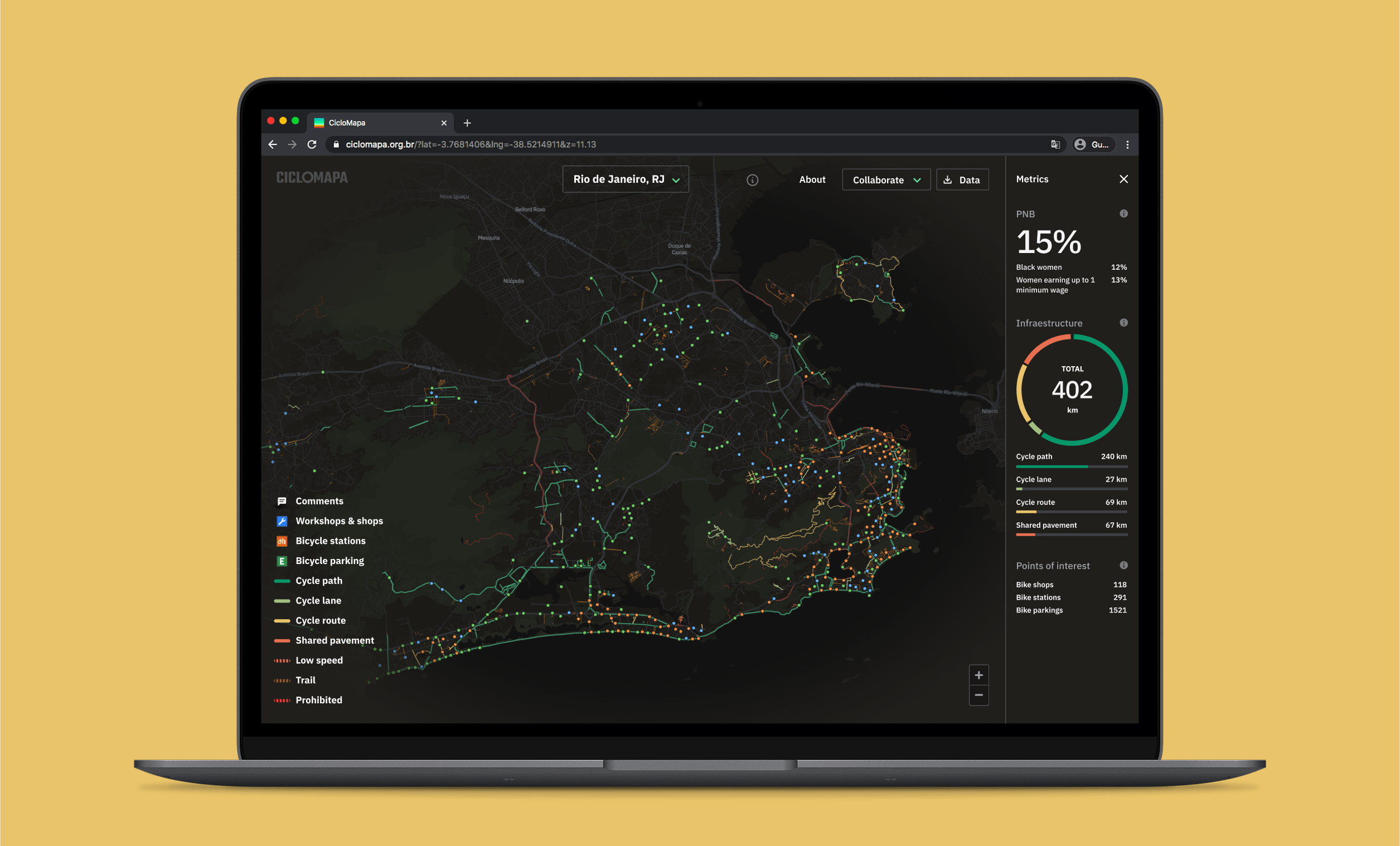
Interactive map
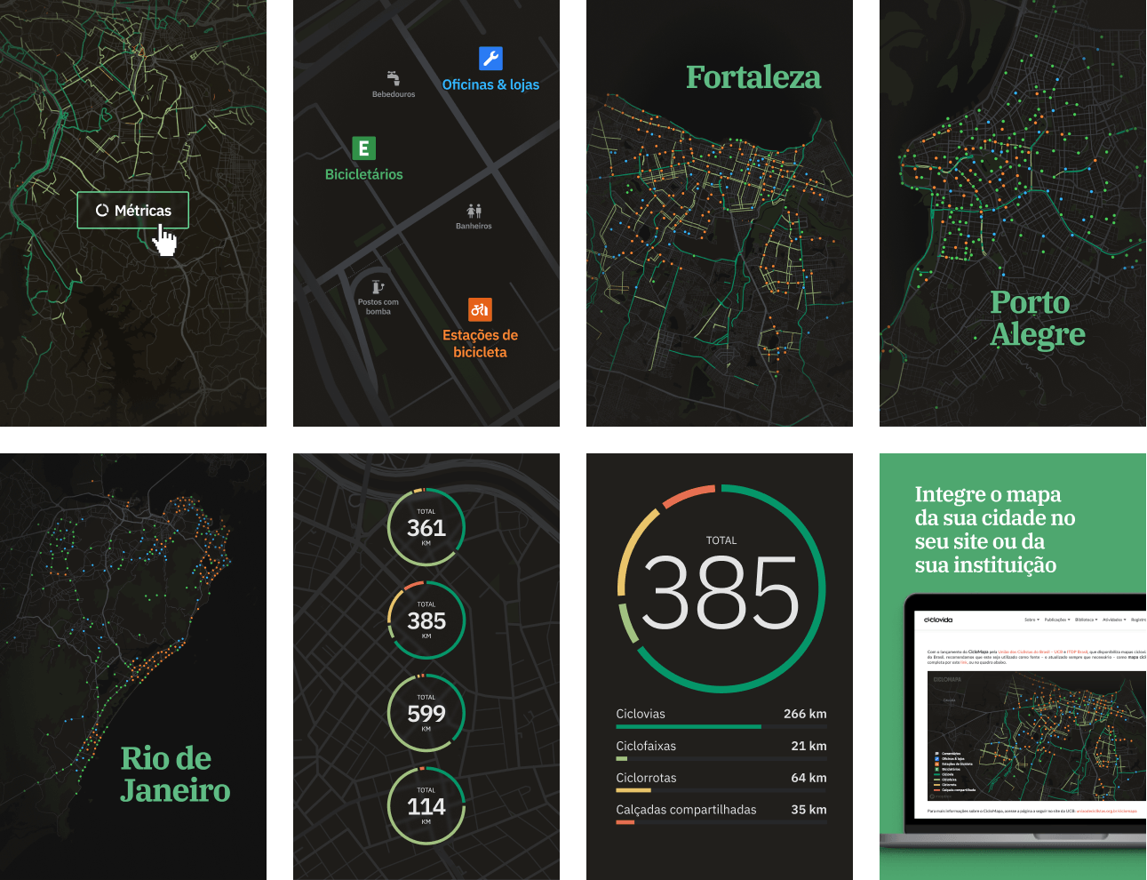
The map is fully interactive, and I focused on offering a seamless experience for exploring different cities and zoom levels. Every small detail was painstakingly refined, from how things appear on different zoom levels to transitions and animations when switching cities.
Interactive and educative filters
Some nice little interaction details are the tooltips on the layers filters. They help educate the user about what each layer type is about.
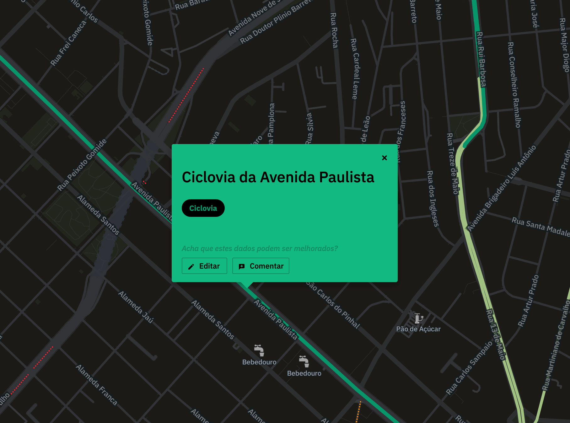
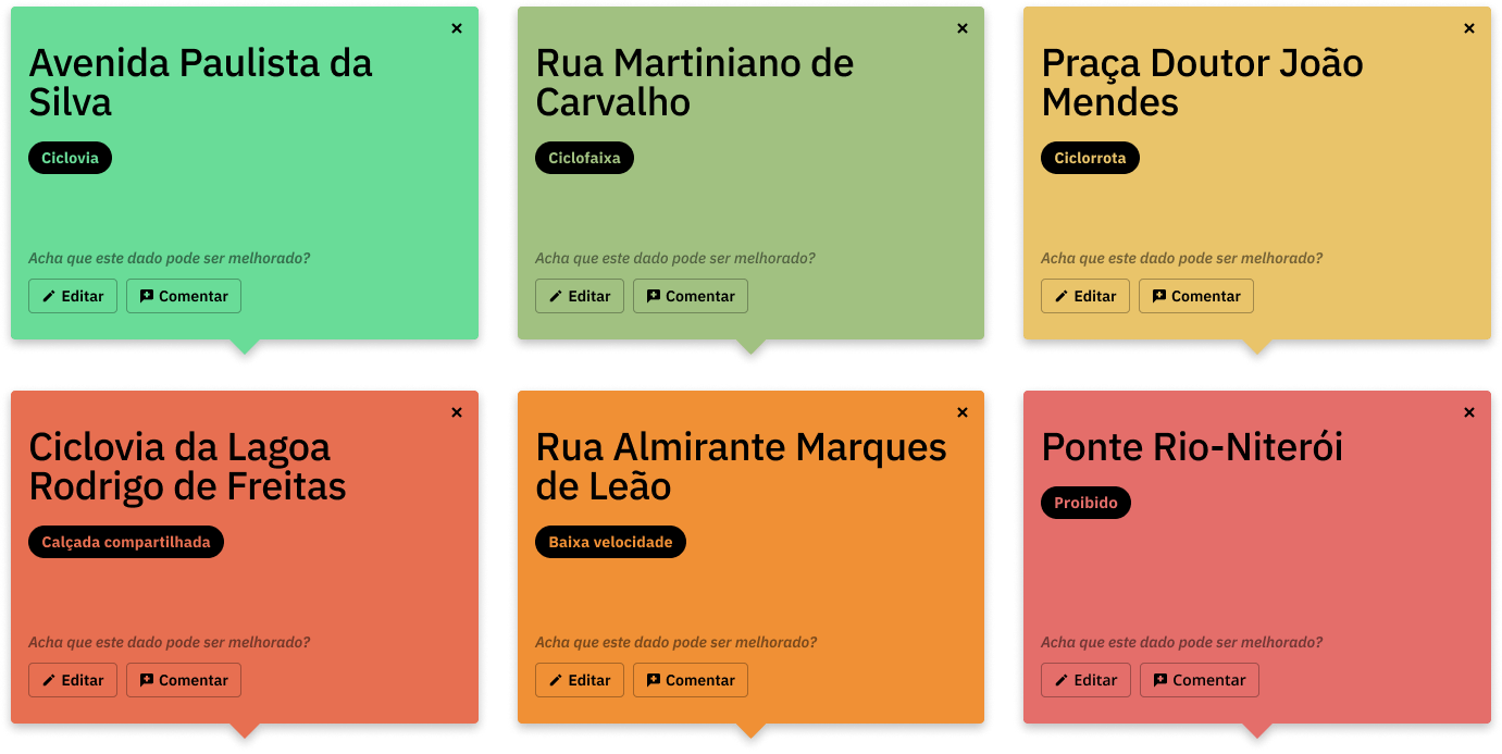
Custom tooltips
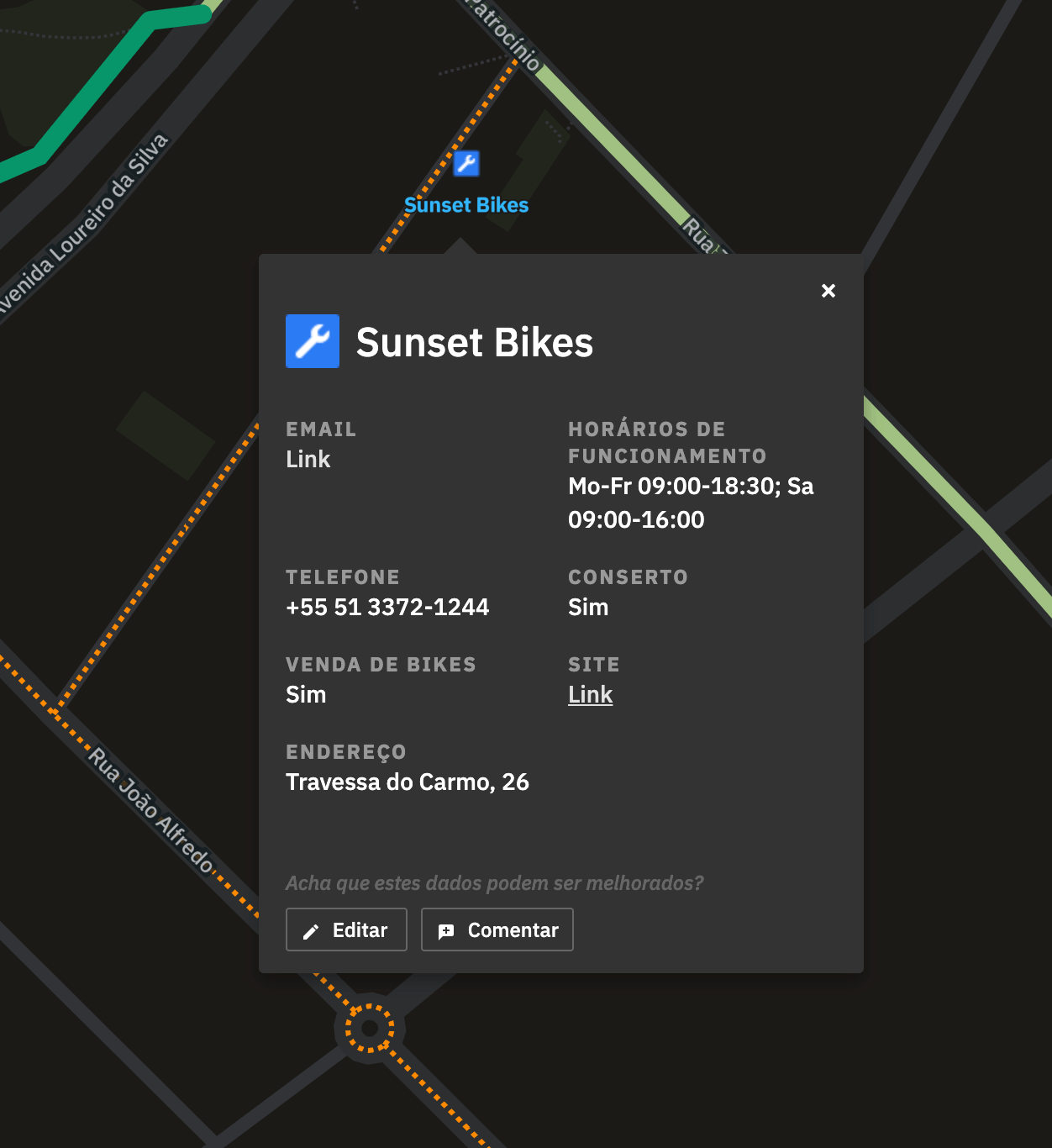
The bike paths have a special, colorful tooltip. On the bottom, buttons invite the user to quickly edit that data in the OSM official website, or to leave a comment inside CicloMapa.
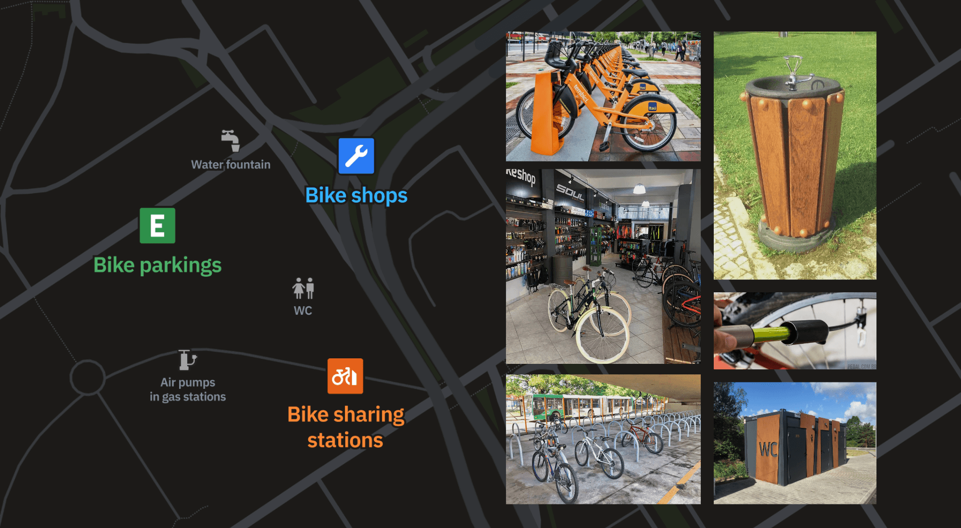
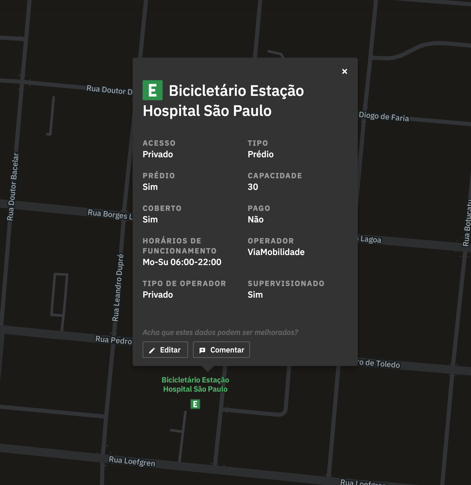
Points of interest
Tooltips for points of interest have more details, which were curated from the several metadata present in the OSM nodes. We made a big effort of understanding which were more important for the common user, as well as translating the technical names.
Marketing assets
I was also responsible for designing social media posts highlighting the different features. These included posts on Instagram, Facebook, Linkedin, and Twitter. Although outside my comfort zone, it was fun being able to hone my skills with graphic design, which is not my main strength and I rarely have opportunity to do as a Product Designer inside the companies I’ve worked.
Results
Since its launch, CicloMapa has become Brazil’s leading platform for bike maps, even without any money spent on advertising it.
We’re glad with the organic coverage from different media channels, mainly with Mobilize and ArchDaily, big portals specialized on mobility. One of ITDP’s webinars that presented CicloMapa also got highlighted on Hacker News’s front page, the legendary tech news portal by Y Combinator.

CicloMapa also had accepted presentations at important conferences, such as FOSS4G (Free and Open Source for Geospatial Conference), Velocity 2018 and FMB 10 (Forum Mundial de la Bicicleta).
This success guaranteed yearly budget updates from the client, which always gave us lots of freedom to design and build the platform’s next steps. Proof of this trust is that in 2022, instead of jumping into building all feature requests we received throughout the years, we instead ran a major Product Discovery research that revealed big new opportunities for the platform. This project might become a new case study here on my website at some point :)
See more
Other projects

"Computers are like a bicycle for the mind."