
VTEX Promotions Admin
Challenge
Redesigning a complex legacy admin in an e-commerce platform to maximize clients' sales and reduce costs.My roles
Date
Context
VTEX is a global SaaS technology company focused on ecommerce solutions that have a daily impact on the work of thousands of people around the world. More than 2500 leading brands of varying sizes and segments, with operations in 26 countries and in global expansion, rely on VTEX for the online sales of their products.
The main challenge of working in such environment is that the product is the same whether you’re a small store or a huge commerce operation. So every solution we design has to leverage a huge diversity of user needs, and build something that works for everybody.
The main touchpoint of our product with the merchants is the Admin. It’s where our clients configure and manage everything related to their commerce operations. It’s also where most of our design efforts go into.
The challenge
The Promotions Admin is the interface where merchants create and manage all kinds of promotions, discounts and other benefits for their e-commerce. It’s used by 99% of VTEX clients in a daily basis, which results in more than 5000 sessions per day by more than 2000 users. Its users vary, but often they’re in Marketing or Commercial teams.
During this project’s research we found out it’s one of the main strengths of the platform, offering a lot of flexibility and power that other competitors don’t. The result is that more than 50% of all sales have some kind of promotion.
Despite its power and proven relevance to our customers’ business, the product evolution across more than 7 years wasn’t closely followed by evolution in its UX. This was made very clear in a chat with stakeholders from USA Sales team, who brought a new perspective of customers from a very new and much more demanding market.
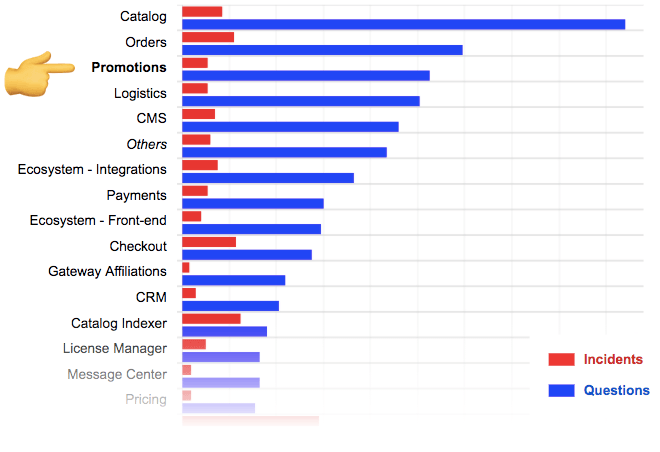
We found that of all VTEX modules, promotions was the 3rd with the most customer questions - almost 400 tickets were opened in the last 3 months. More than improving the efficiency of our Support team to answer tickets, we always ask ourselves: what could we do to prevent the ticket from being created in the first place? It was the UX could be improved a lot.
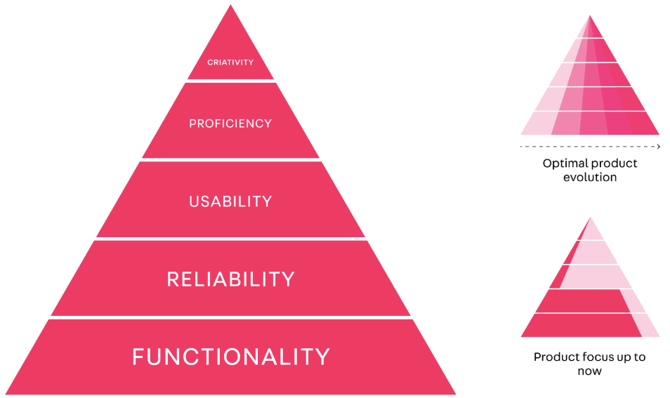
Historically the company’s products have been led by the engineers themselves, who usually care more about the product’s functionality than other more subjective dimensions such as ease of use. With the recent growth of the Design Team at VTEX, the concern with bringing balance to these different dimensions that form the experience of a product has grown. A notable initiative that we leveraged in this project was the Design System, offering components and guidelines that was trying to consistently raise the bar of UX quality throughout the platform.
Process
Discovery
With some main stakeholder’s vision at hand and having understood this was a project worth working on I started devising a research plan to validate some assumptions and understand in more depth where we were getting into.
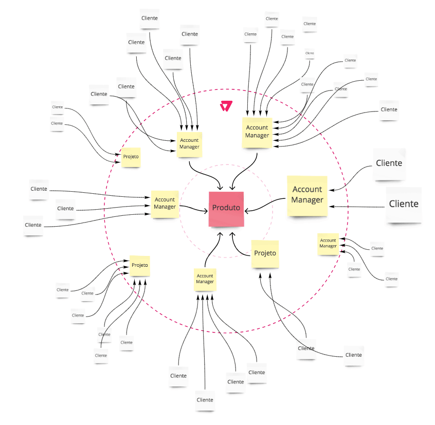
We went after other stakeholders in the company to enrich our vision of how the product was perceived by customers and what improvements we could make. Our focus was on Account Managers who, with their own words, “defend customers within VTEX and defend VTEX within customers”. My objectives were:
- Understand the importance of the product to VTEX
- How it’s perceived by our customers
- How it compares with the competition
- Understand the use cases and business needs
After almost 20 interviews with both internal stakeholders and customers we concluded many things, in particular:
- In fact the module already has great features, standing out from the competition and being one of the flagships in the platform’s sales pitches.
- There were some functionality improvements that could be done, but…
- The amount of functionality, however, negatively impacts its ease of use. It’s not considered intuitive, it raises many doubts and sometimes even leads the user to make mistakes that can be financially disastrous.
- Some new features recently launched were confusing and didn’t get much traction, so we had an opportunity to rethink them as well.
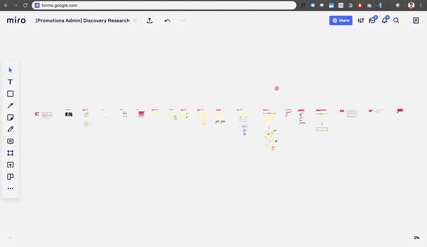
The research generated lots of insights, which I summarized in a Miro presentation (below) that was a great reference that we would go back several times during the design and development of this project.
Delving deeper with data
With a bunch of insights, impressions and assumptions at hand we turned to looking at how users actually used promotions at VTEX. In December 2018 alone there were more than 60,000 promotions running on the platform, which is a rich source of data on how users actually the system in real life.
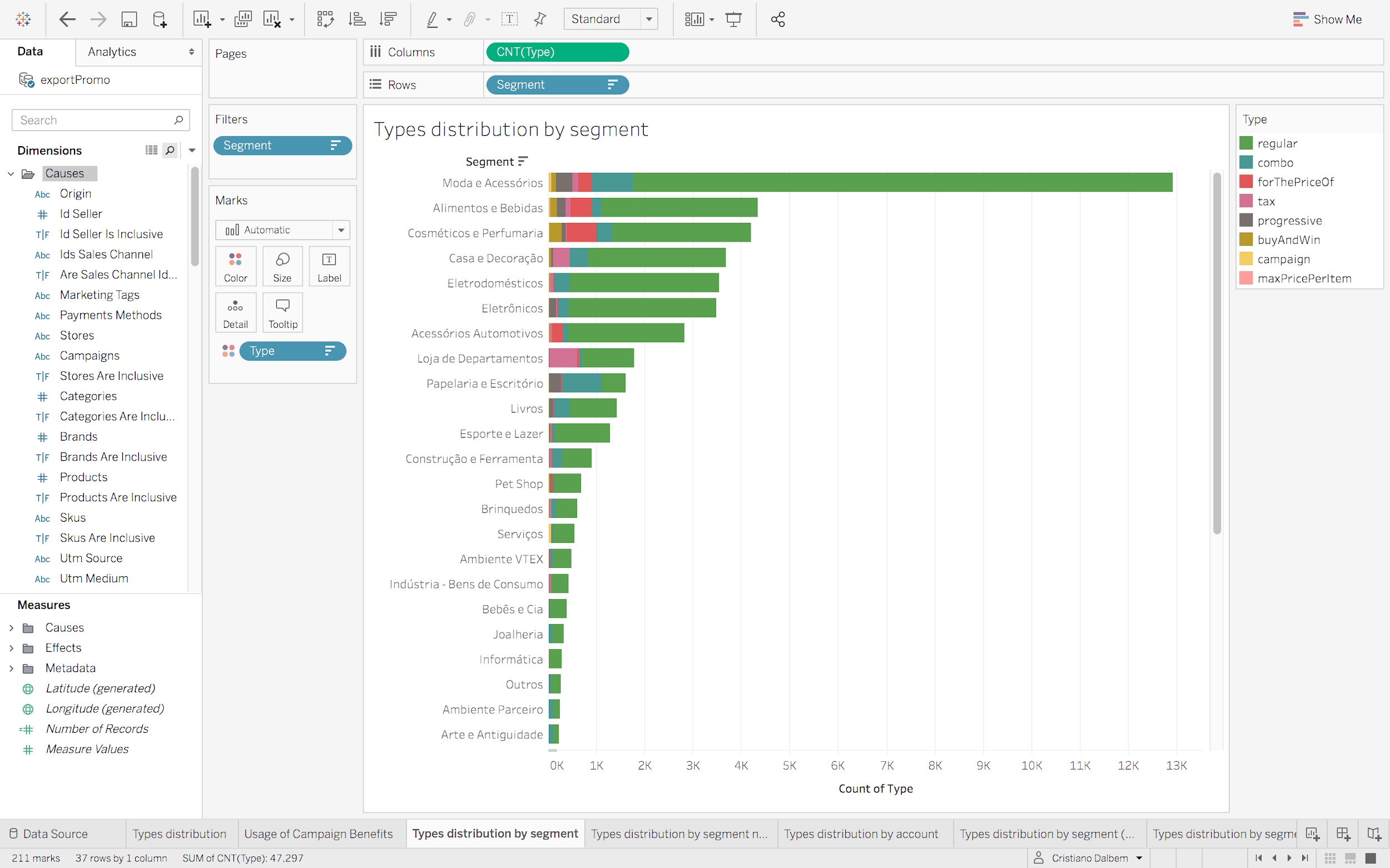
Our first step was to validate the hypothesis that the interviewees brought us that Regular Promotions were much more used than the others. This hypothesis was not only confirmed, but the result was shocking because most of the recent team’s efforts were focused in a feature very few customers were using.
This discovery inspired us to, for the first time, generate detailed documentations about the supported features and their rates of usages, which helped us prioritize them as well.
Exploring solutions
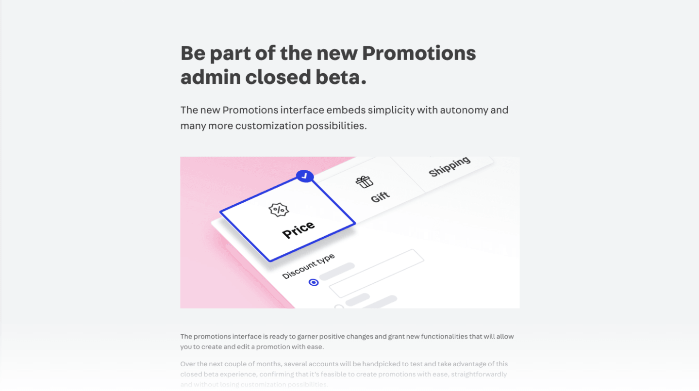
Promotion creation form
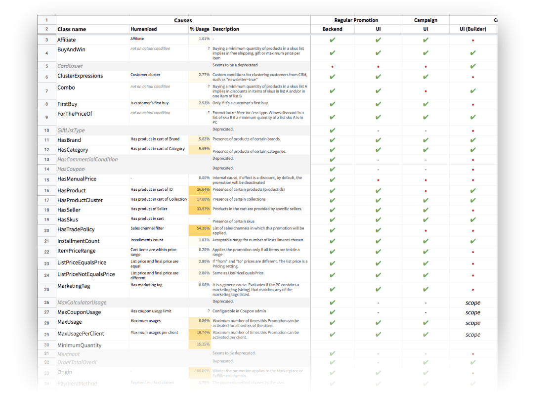
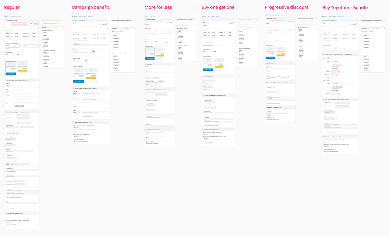
The first and most notable problem was the different types of Promotion, the differences of which were not always clear either conceptually or visually. When we put together the screens for creating and editing the different types of promotion, it is very clear that the differences are very small, and are always based on the effect of that promotion. Our solution was to create a unique type of promotion.
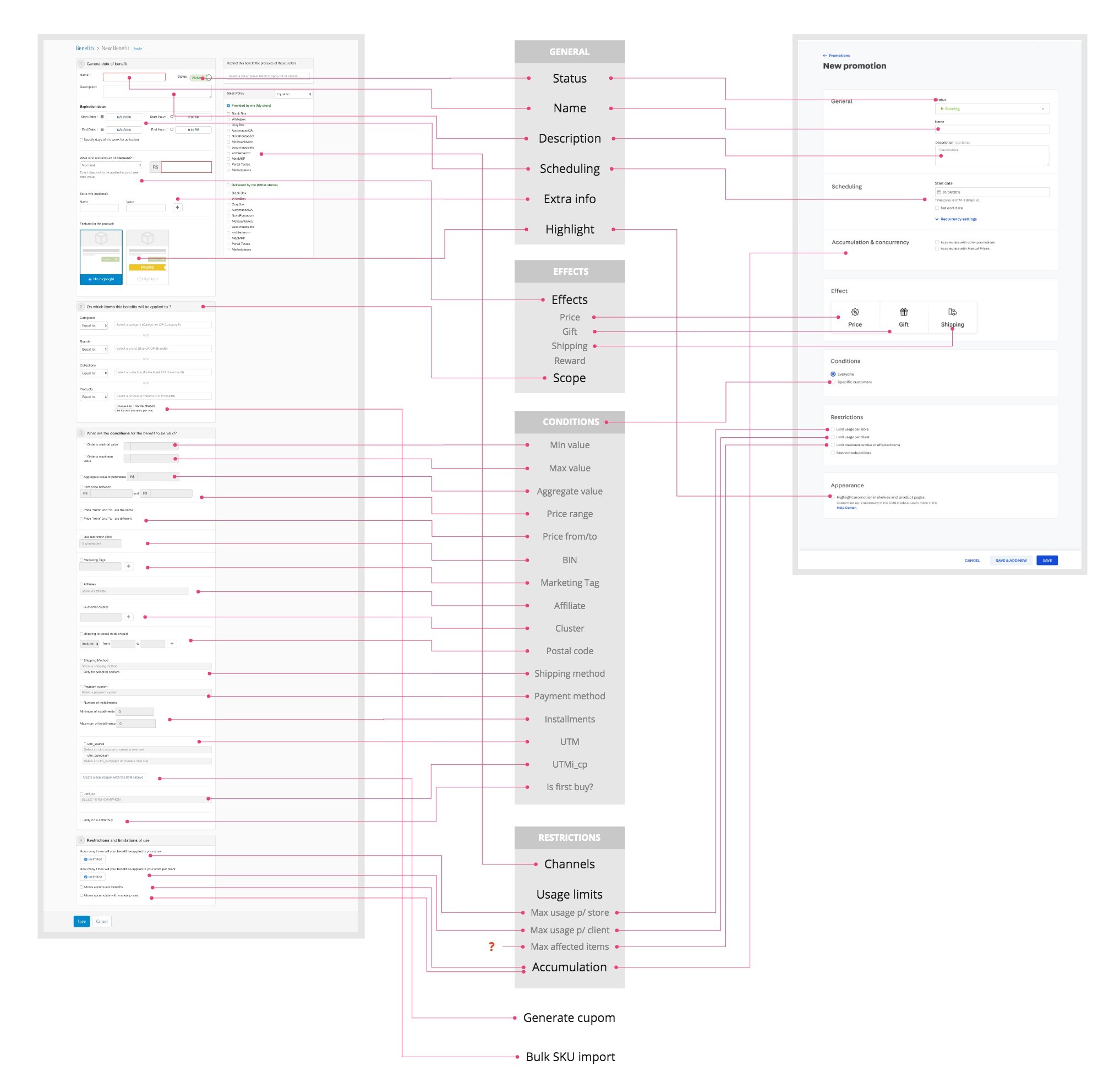
Conditions builder
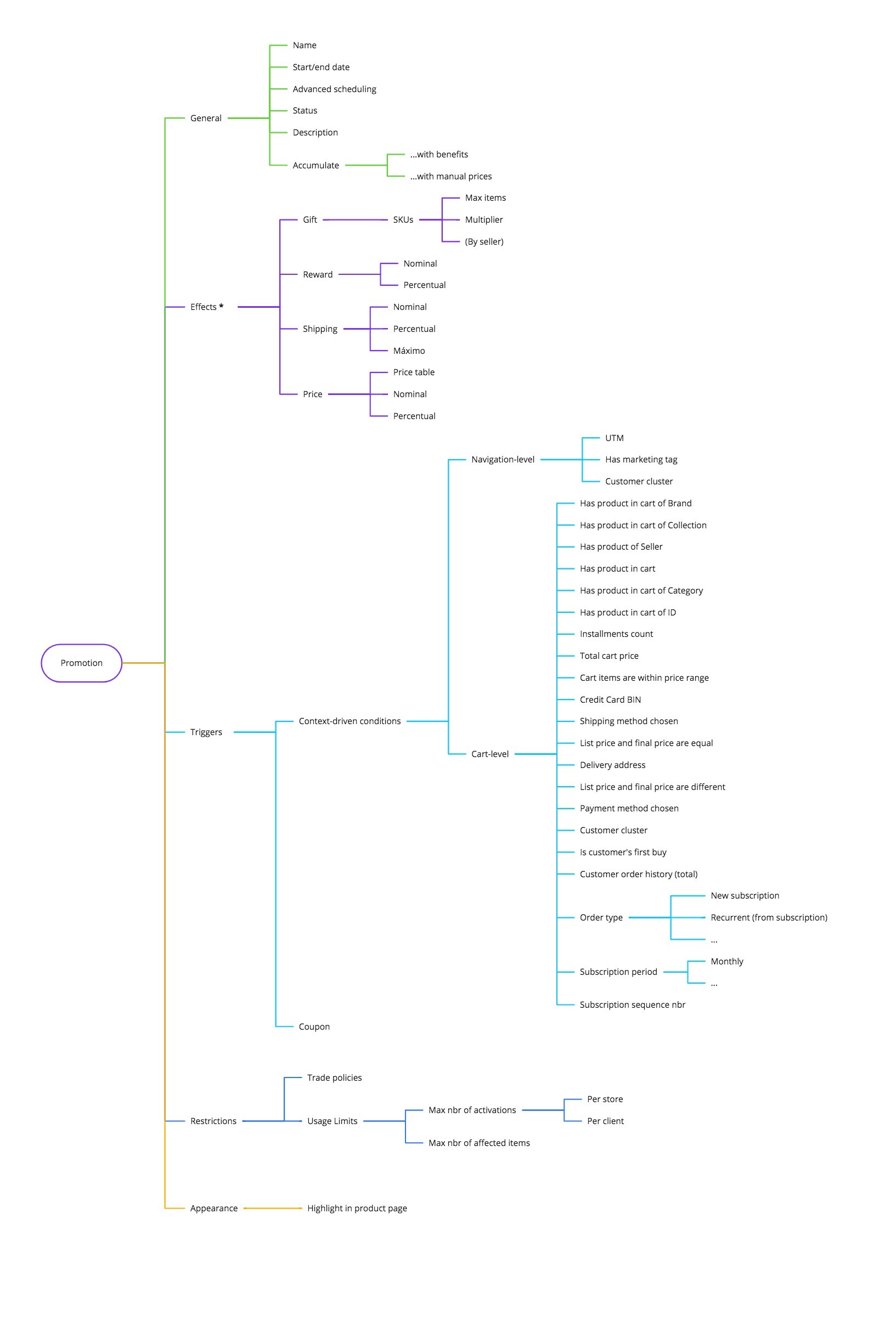
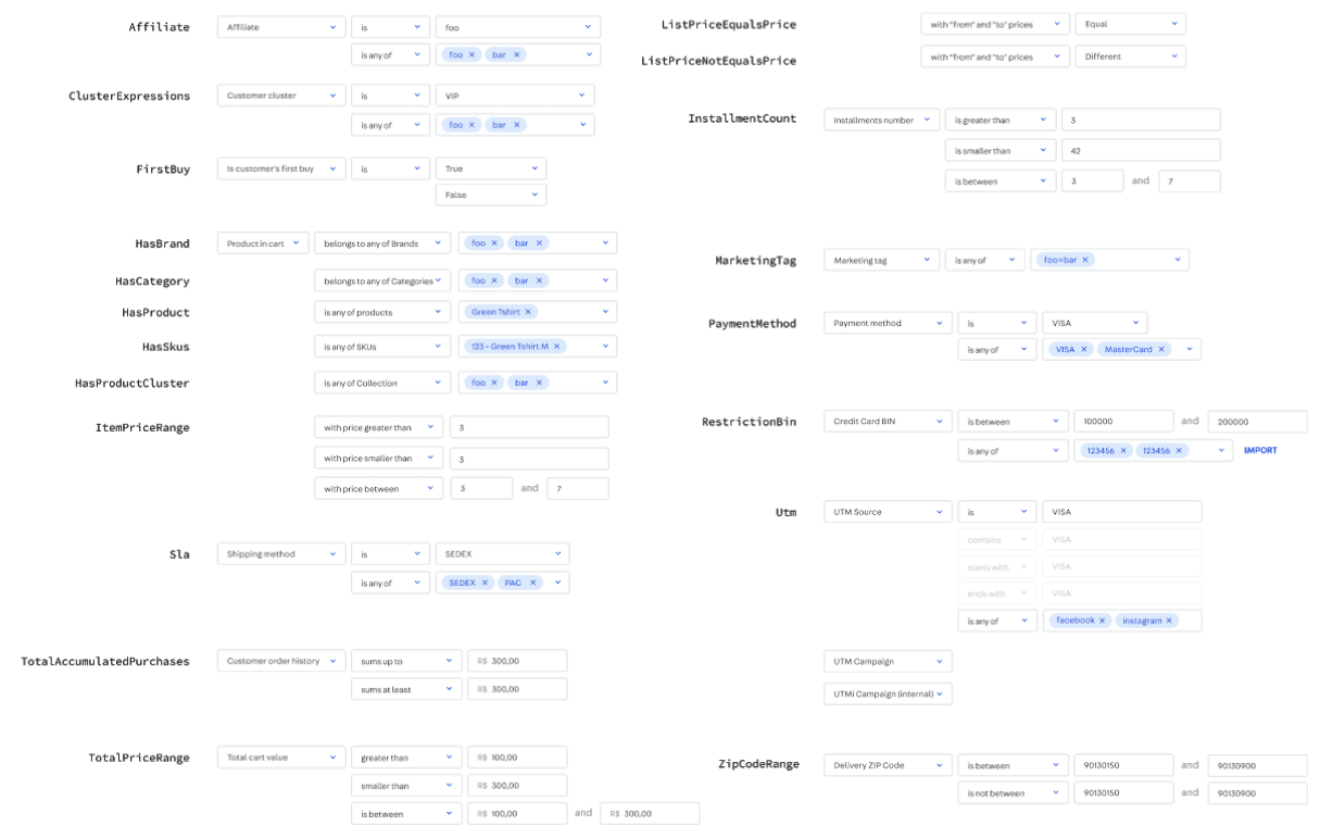
The context-driven conditions system which is where our engine shines. It’s very flexible, offering thousands of possible combinations for creating customized promotions. However we believe that the interaction paradigm was not the best: simply by listing all the options, the complexity of the screen is proportional to the flexibility of the system, which ends up undermining our intentions to keep evolving this system.
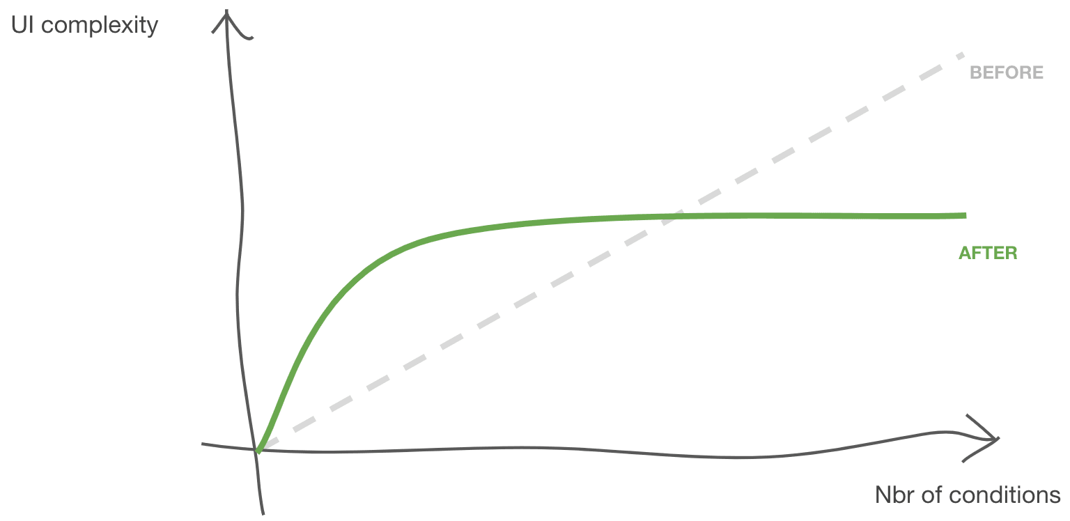
In our new solution, the initial complexity of the screen is always the same regardless of the number of options we offer, and it grows linearly as the user demands greater complexity of business rules. In short, in the new paradigm, complexity grows with user demand, not with the power of the system.
The Conditions component resembles natural language, and it’s structured like this:
[subject] [verb] [object]
Enabling the user to progressively build their conditional “statements” leveraging a common interface for all filters. It also accepts a global selector for changing the boolean operation, making the system even more powerful than the previous. This meant the new admin could support all previously existing conditions but enabling many more combinations.
Dashboard
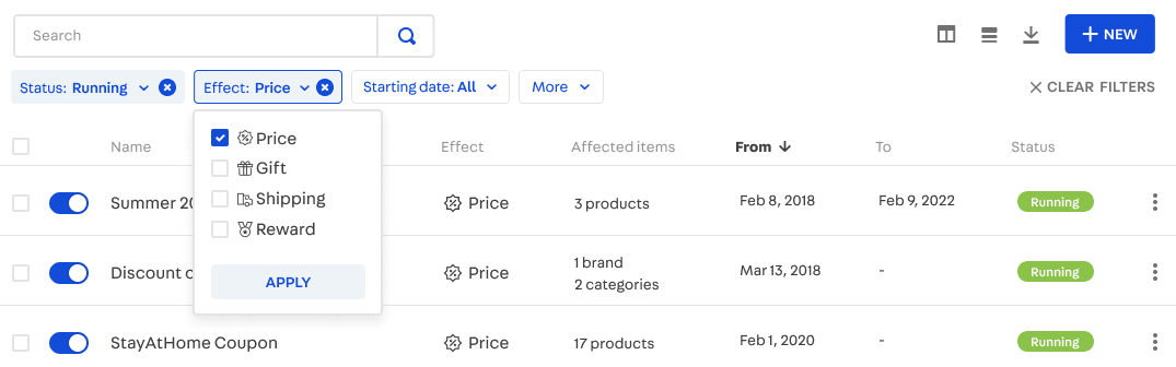
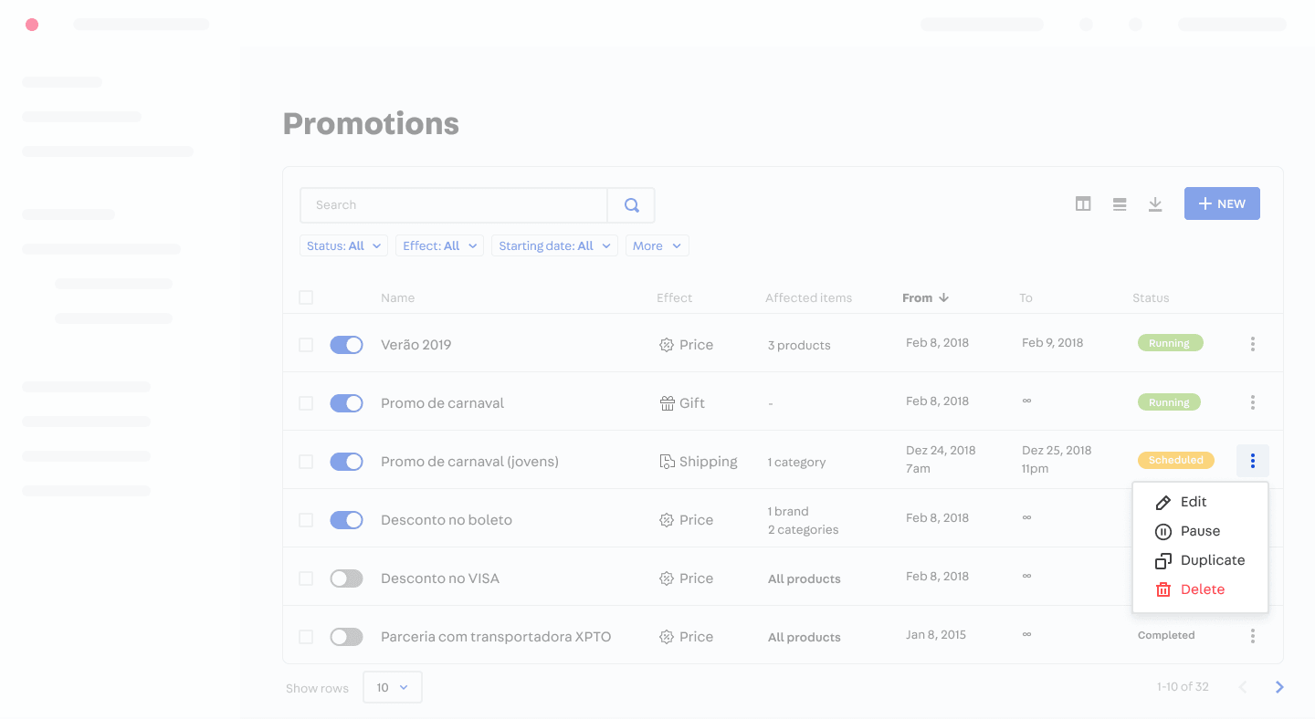
The list of promotions was also mentioned by some as excessively confusing. It uses a content diagramming paradigm popularly known as “card”, which is quite visual but when compared to a simple table it makes comparing data between entities much more difficult. Our solution was to leverage and evolve the Table component of Styleguide, developed especially for building complex and powerful admins without giving up the clarity of information and intuitiveness.

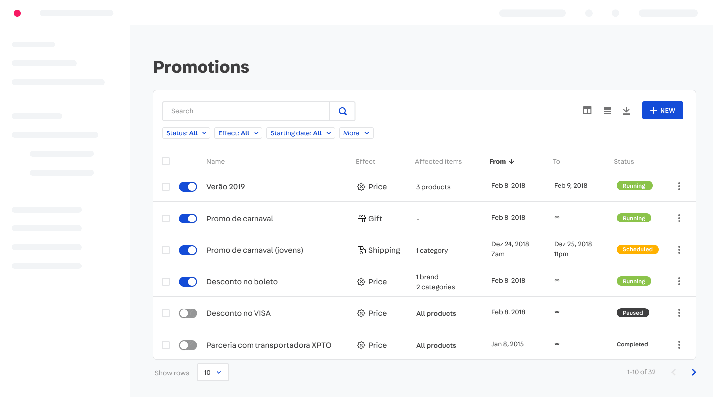
During this project we created a new filters system, which was integrated into the VTEX Design System and reused in many other admins later. You can read more about this component and the process behind it in my VTEX Design System case study.
Simulator
Another common cause of misunderstanding of the system comes from the way promotions accumulate or compete with each other. This means that, given a scenario with sufficiently complex business rules, the operation of the system becomes more unpredictable, and interrelationships between dozens of promotions can have undesirable effects, such as making a product price go to zero.
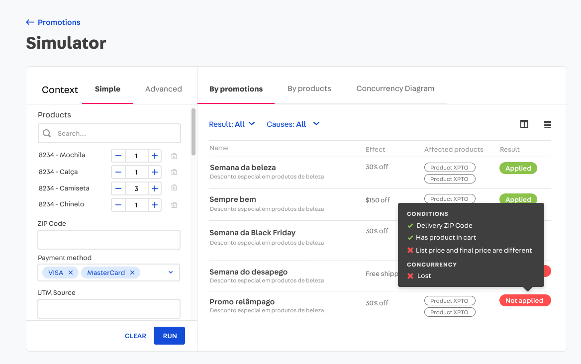
This new feature for the Promotions Admin simulates for a given shopping cart which promotions would be activated, why is that and the resulting effects for the products in that cart.
Little big details
As of a work tool that people might have to be using everyday, the small almost forgetable details in the UI that sometimes improve the best the productivity. Here’s a couple of these.
A very common action the users needed was to duplicate existing promotions since very often their commercial campaigns would repeat seasonaly but with important modifications. Other than handy actions that now were available directly from the dashboard, we created the duplicate feature.
Some merchants want to create a promotion starting of now and just end it when they feel like. Others want it to start next week, last for the whole month and only go live on mondays through fridays from 7:15 to 11:20 and from 14:00 to 18:00.
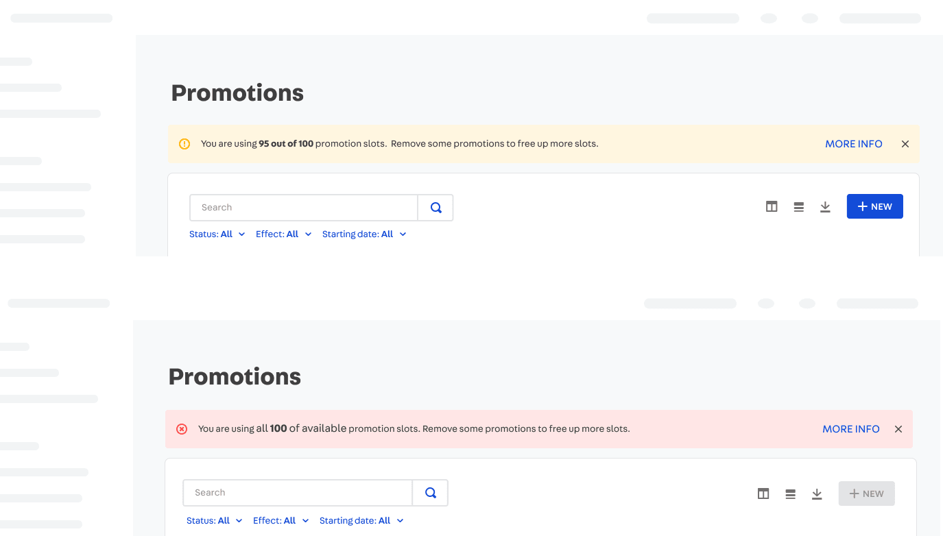
A pressing concern for some users is the limit - and for others, not. That’s why in the new Admin instead of always showing the current usage of limit in the UI we have contextual messages that appear when needed.
Results & Learnings
Unfortunately the project development had many obstacles. By the time I left the company we had just started a Beta Program where selected customers would be able to try a very early version of the final product, so I didn’t have the opportunity to measure results.
One of the main learnings from this project is that, even if I contributed intensely with the Engineers during the Discovery phase, there was still room for improving how we broke it down and prioritized its parts to deliver value more quickly and iteratively. It also taught me the importance of having a Product Manager, a role the company was barely starting to value and hire at that time.


"Computers are like a bicycle for the mind."